
Performance
The Performance dashboard is a flexible way for you to track performance of your organization, group, location or account by aggregating, ranking and proportioning your data over a selected period of time.
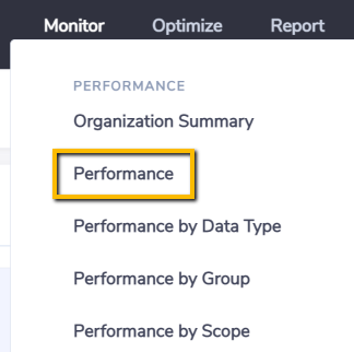
The dashboard can be found in the Monitor menu for Organization level users.
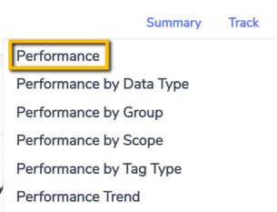
and in the Track sub-menu at the Organization summary.
Activity by Data Type
This chart ranks your data aggregated by Data Types using the unit of measure selected. Only data types relevant to the unit of measure selected in the View As dashboard option are included e.g. if Energy(GJ) is selected then water data types would not be included.
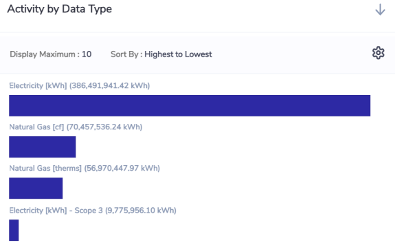
By default the top 10 bars are displayed and you can increase that and change the sort by by using the Settings icon option on the top right of the chart.
The data type names always include the primary measure (native reporting unit) of that data type e.g. Diesel Stationary L. Then next to the data type name is shown the unit of measure you have selected to view in the dashboard i.e you are converting L (litres) to GJ for the purpose of being able to aggregate and rank data types of different primary measures using a common measure.
Activity by Period
This chart aggregates your data by month. The blue bars represent the period range you have selected and the grey bars represent the comparison you have chosen. The left hand y-axis is the unit of measure you have selected as your View As dashboard option.
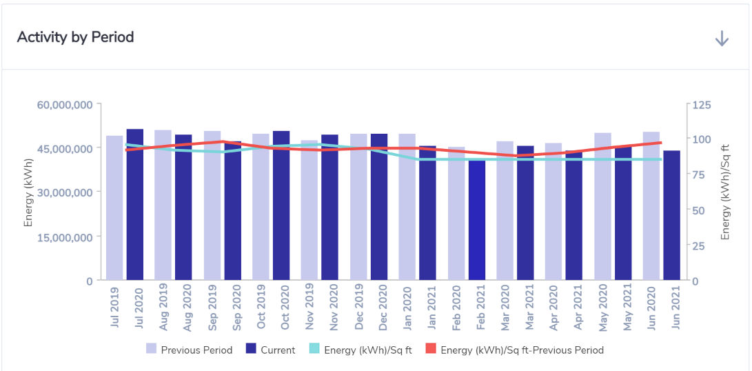
If you chose to track an intensity by selecting a KPI metric then the right hand y-axis is the intensity. The purple line represents the intensity for the period you have selected and the light blue line represents the comparison you have chosen.
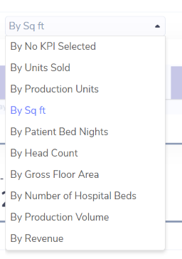
To select a KPI use the By option and select from the KPIs set up for your Organization.
Important Note on Intensity Calculations
Please note that the Intensity figures are calculated in two different ways depending on whether the KPI selected is an Accumulative measure (one that sums over time) like Production Volume or an Instantaneous measure (ie one that doesn't sum over time) like Floor Area.
For accumulative KPIs the intensity calculation for each month is simply: Consumption / KPI.
For instantaneous KPIs the intensity calculation for each month is annualized: Consumption / KPI / number of days within the period * 365
The reason we annualise intensity figures when the KPI is instantaneous is so that periods can be compared in true like-for-like fashion. Unless the intensity is annualized the intensity value would fluctuate depending on the period selected. For example months with different numbers of days – eg. Jan (31) vs Feb (28) – but with identical daily rates of consumption would have different monthly intensity values.
See a worked example below:
January consumption = 31,000 kWh
Floor area = 50 m2
Non-annualised intensity = 31,000/50 = 620 kWh/m2
Annualised intensity = 31,000/50/31 *365 = 7300 kWh/m2
February consumption = 28,000 kWh
Floor area = 50 m2
Non-annualised intensity = 28,000/50 = 560 kWh/m2
Annualised intensity = 28,000/50/28 *365 = 7300 kWh/m2
Both months have the same daily rate of consumption (1000 kWh/day) but would have different intensities because of the days in the period if we didn't annualise the intensity.
Activity by Location
This chart ranks your data aggregated by Locations using the unit of measure selected.
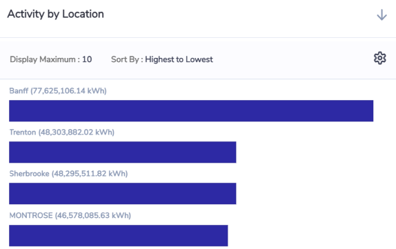
By default the top 10 bars are displayed and you can increase that and change the sort by by using the Settings icon option on the top right of the chart.
Activity by Group
This chart shows you the portion of your aggregated data by Group.
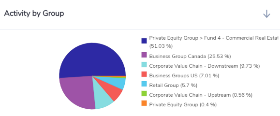
A maximum of 10 portions are shown in pie charts. If there are more than 10 portions then 9 are shown and the remaining are aggregated into Other.
When you view this dashboard at the organization level then this chart proportions based on the top level classification groups.
When you view this dashboard at the organization level but you filter on a specific classification group then this chart proportions based on the classification sub-groups immediately below the selected group in the hierarchy.
When you view this dashboard from a classification or portfolio group level then this chart proportions based on the sub-groups immediately below the selected group in the hierarchy.
Activity by Category
This chart shows you the portion of your aggregated data by Category.
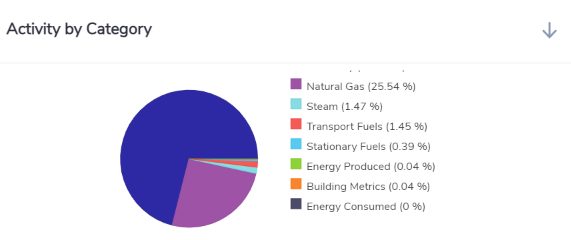
A maximum of 10 portions are shown in pie charts. If there are more than 10 portions then9 are shown and the remaining are aggregated into Other.