
Dashboard Options
Most Envizi dashboards have the following options for you to be able to customize your view.
Period
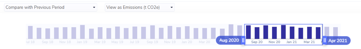
You can select the time period for analysis using the time-scale:
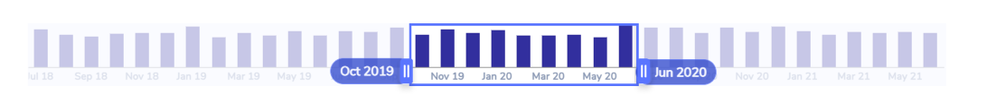
You can drag the highlighted area to select other months and you can click on the either edge of the highlighted box and drag it in or out to select a smaller or larger period. You can only select a maximum of 12 months.
Compare With
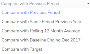
If your Organization has set a baseline year then in some dashboards you will also see Baseline Ending <MMM YY> as an comparison option.
If your Organization is entitled to the Target Tracking module then in some dashboards will be also see Target as a comparison option.
View As
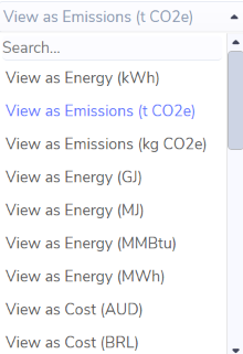
Most dashboards allow you to choose whether you want to view your data aggregated as an Energy unit of measure, Emissions unit of measure, Cost, Mass unit of measure or Volume unit of measure.
The View As will default to the unit of measure your Organization has selected as its default.
You can use the search at the top of the drop down to quickly find the unit of measure you are looking for.
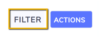
Filter
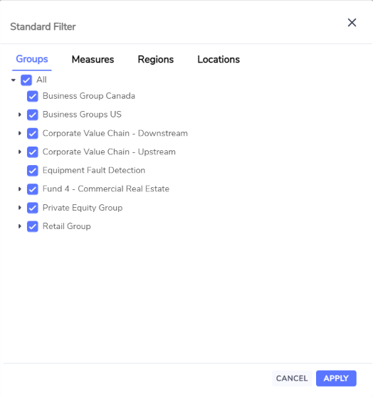
You can filter on various criteria in dashboards by clicking on the Filter button in the top right.
Dashboards may have different filter criteria available depending on the purpose of the dashboard.
By default all values are selected. To filter out a value click on the tick box (no tick). To apply your filter changes click Apply.
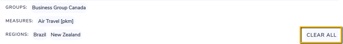
Once you have applied filters you will see what you have filtered on at the top of the dashboard below the dashboard name.
To quickly return to the default of all values being selected, click Clear All.
Once you change any of the above options in one dashboard then they will be remembered as you navigate to similar dashboards within the same login session
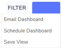
Actions
Once you make the customizations you want to a dashboard you can email the dashboard, schedule an email on a regular basis or save the dashboard view so you can quickly access it any time with your preset customizations.
Grid Views
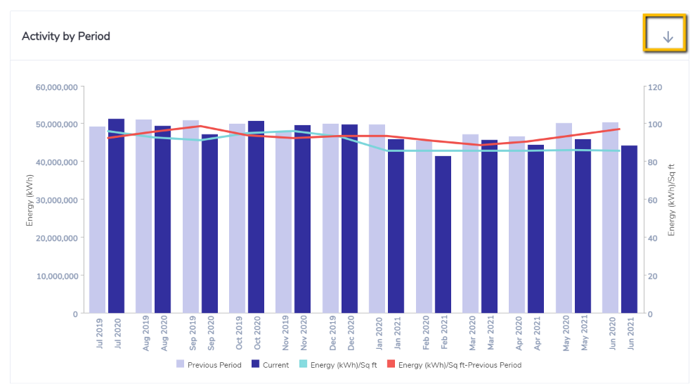
Many of the charts in the dashboards will have the option for you to view the data in a grid. by clicking on the down arrow icon in the right of the chart heading.
A grid view will open with many of the regular grid options available to you.
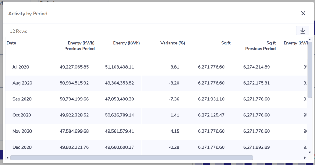
Chart Settings
Some charts in the dashboards will have the option for you to customize the display of that particular chart by clicking in the Settings icon 
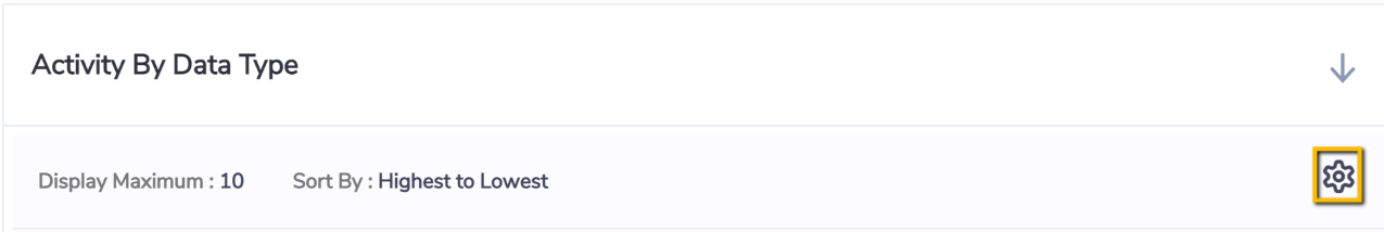
For example: horizontal bar charts allow up to change the default top 10 items to show in the chart to be a bigger number and to change the sort order.
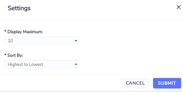
Horizontal bar charts by default show a maximum of 10 bars (the top 10). You can view more bars by changing the chart setting as per above or you can also quickly view all data rows for that chart in a grid view by clicking the View All hyperlink at the bottom right of a chart. The View All option only appears if there is more than 10 rows of data.
Options or values in the options may not be available on every dashboards as only options and values relevant to the purpose of the dashboard are made available.
Dashboards may have additional options or values in the options in order to support the specific purpose of those dashboards.