
Performance by Group
The Performance by Group dashboard is a flexible way for you to track performance of your organization or location based on ranking and proportioning your data into group views over a selected period of time.
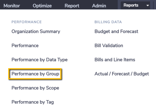
The dashboard can be found in the Monitor menu for Organization level users.
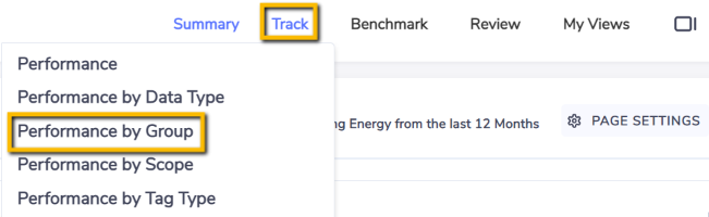
and in the Track sub-menu at Organization and Group.
Activity by Group
This chart ranks your data aggregated by groups using the unit of measure selected.
When you view this dashboard at the organization level then this chart represents the top level classification groups.
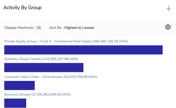
When you view this dashboard from a classification or portfolio group level then this chart proportions based on the sub-groups immediately below the selected group in the hierarchy.
By default the top 10 bars are displayed and you can increase that and change the “Sort By” by using the Settings icon option on the top right of the chart.
Activity by Period by Sub-Group
This chart aggregates your data by sub-group by month for the period you have selected. Each color in the stacked bars represents a sub-group.
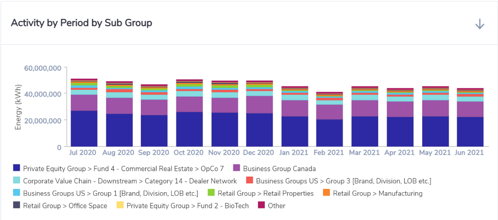
A maximum of 10 sub-groups are shown. If there are more than 10 sub-groups then 9 are shown and the remaining are aggregated into Other.
To see the values per sub-group per month for the comparison you selected you can select the Grid view option on the top right of the chart.
When you view this dashboard at the organization level then this chart represents classification sub-groups immediately below the top level classification groups in the hierarchy..
When you view this dashboard from a classification or portfolio group level then this chart represents sub-groups immediately below the selected group in the hierarchy.
Activity by Sub-Group
This chart shows you the portion of your aggregated data by Sub-group.
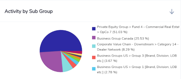
A maximum of 10 portions are shown in pie charts. If there are more than 10 portions then 9 are shown and the remaining are aggregated into Other.
When you view this dashboard at the organization level then this chart represents the top level classification groups.
When you view this dashboard from a classification or portfolio group level then this chart proportions based on the sub-groups immediately below the selected group in the hierarchy.