
Utility Cost Analysis
The Cost sub-menu within UDMA holds organizational level cost analytical tools. It includes cost analysis dashboards as well as analytical reports. Other analytical tools are available to you at a location or account level (e.g. Performance dashboard).
Group level user
If you are a Group level user, the Cost sub-menu is available from the Group summary page.
Cost Analysis Dashboard Overview
The Cost Analysis dashboard is one of the core analytical engines of UDMA. It can be used to:
Identify outliers, variations and anomalies - you can identify unusual data patterns in utility billing data, such as unusually high cost intensity, material variations in utility rates or unexpectedly high costs or consumption. For each anomaly you can drill down into consecutively greater detail, right through to bill images.
Rank and prioritize issues - you can rank locations by severity of issues, using a variety of criteria (e.g., variance %). This allows you to focus on the anomalies that represent the greatest cost-saving opportunities.
The analysis is generally achieved through variance checking and subsequently followed by peer benchmarking. It is based on normalized calendar month billing data (for both cost and consumption) and using Locations as the comparison entity. To start the analysis, user needs to first define the analyzing criteria:
Current Period - this is the time period the utility billing data will be analyzed on, e.g., from Oct-2015 to Dec-2015
Comparison Period - this is the time period to be compared with, it could be the same time period last year, or just the previous time period (e.g., compare with last quarter)
Account Styles - whether the analysis should be focused on all account styles or a selective account styles only (e.g., only to look at large market Electricity accounts)
Groups - it is important to choose one or several Groups that have Locations of similar type to perform the analysis. If the Locations involved are of different use in nature (e.g., branch office vs manufacturing factory), then the result of comparing them to each other may not be very effective.
Once you have selected the analyzing criteria from the user interface, the dashboard calculates the variance and absolute values for each Location. The analysis result is represented to you in bar charts so that any anomalies or outliers can easily be identified. The dashboard also provides a table view of all the data points being analyzed, from which you can rank and prioritize issues using a variety of criteria that suits your purpose (e.g., rank all locations by cost variance %).
There are generally 3 Cost Analysis dashboards available for each utility type. They are essentially the same in terms of its look and feel. The only main difference is the type of utility data that is being analyzed on.
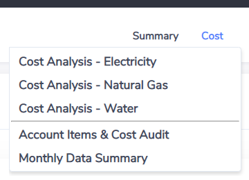
Cost Analysis - Electricity
Cost Analysis - Natural Gas
Cost Analysis - Water
In this document we will walk through the 'Cost Analysis - Electricity' dashboard only but the same can be applied to the other two dashboards as well.
Why I can't see all 3 dashboards?
If you can't see all 3 dashboards available under the Cost menu, mostly likely it is because your Envizi data set does not contain this type of utility data (e.g., no Water data captured in Envizi). However if you believe you should have access to the other dashboards, please contact Envizi support.
Cost Analysis - Electricity
The Cost Analysis - Electricity dashboard allows you to analyze your Electricity billing data. The dashboard can be accessed either via the link from the Verify main menu or through the Cost sub-menu in UDMA. Once you have clicked on the link the dashboard will start to load. It usually takes a while when first loading the dashboard depending on the number of locations and accounts being included. Once the dashboard has loaded completely, you can start to define the analyzing criteria before looking at the result with more details.
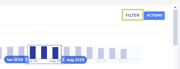
Step 1: Choose what to be analyzed - define the analyzing criteria and reporting unit
Period selector - use the time period slider to specify the current reporting period for which the Electricity data will be analyzed. Any number of months up to 1 year can be selected.
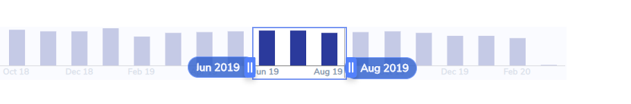
Comparison period - this is the period the data variance will be calculated and compared against. There are 3 options - Previous Period (default), Same Period Previous Year and Rolling 12 Month Average.
Reporting unit - A list of reporting unit for utility data. Available options for Electricity and Natural Gas includes kWh, MWh, GJ, MMBtu and MJ. For Water the options are m3, cubic feet, gallon and litres.

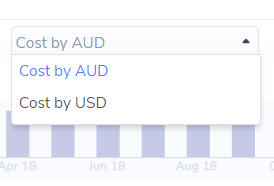
Currency - the type of currency the cost will be reported in. It usually defaults to your local currency (e.g. AUD) and includes USD as the other option. Depending on your organization's geographical data presence and settings in Envizi you may have other currency codes appearing in the list. This is the same currency code list you will find in other dashboards of the platform (e.g. Performance dashboard).
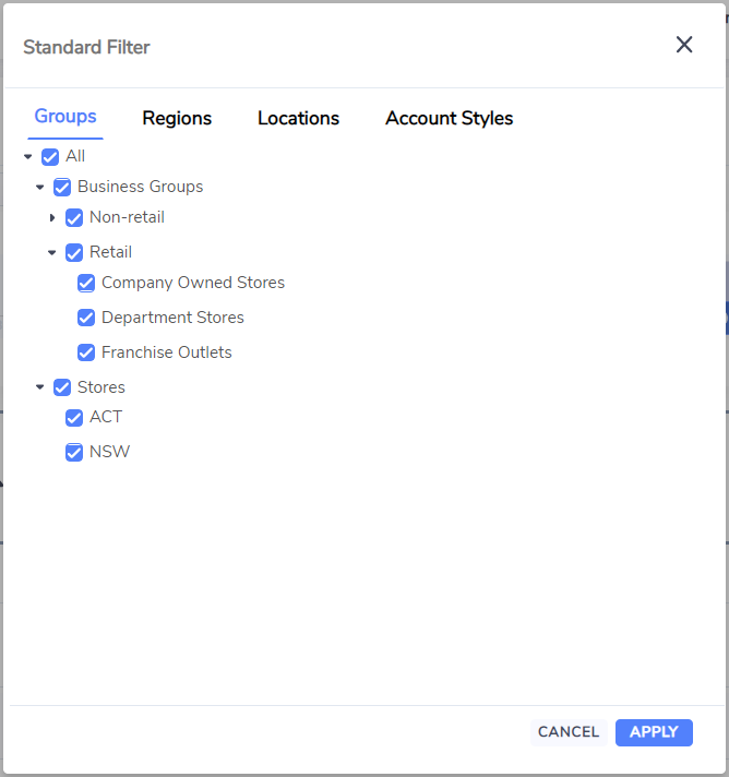
Step 2: Choose what to be analyzed - Groups, Account Styles, Locations and Regions
Click on the filter icon on the top right hand side of the page.
The filter contains:
Groups filter - a list of all classification groups to be chosen from. The importance of choosing group(s) is - usually it does not deliver meaningful result to compare all locations across the organization (but there are exceptions) so it is necessary to reduce the scope by selecting locations of similar types which are usually grouped in the Groups. It is important to compare apples with apples only.
Regions filter - select the locations of particular geographical regions to be analyzed. Regions here refer to Envizi's default geographical regions and are defined as in the region field of Location.
Locations filter - select the locations to be analyzed. This is useful especially when excluding certain locations from the analysis is required.
Account Styles filter - select the Account Styles to be analyzed. For example, only to look at large market Electricity accounts.
Summary information panels - Total Cost, Total Consumption and Effective Unit Cost of the data set based on the selected analyzing criteria are displayed. Effective Unit Cost is a similar to the concept of blended rate which basically equals to value of Total Cost divided by the value of Total Consumption.

Dashboard Refresh
Due to the nature of the dashboard, which is generally data intensive, if any of the selection criteria is changed, the web page will automatically refresh to reflect the changes. Sometimes it may take a while to completely refresh the page due to the sheer volume of data points involved (all cost and consumption data will need to be retrieved and have their analytic re-calculated again). Therefore it is suggested that the prior to using the dashboard, the selection criteria need to be decided in advance so to avoid unnecessary dashboard refreshes if possible, and also to expect a few rounds of web page refreshes before you can look at a meaningful analytic result in details.
However, some of the selection criteria such as current reporting time period, view as measures etc. are remembered by the system. So during the same login session period, when you navigate to another dashboard or navigate back to this dashboard from other parts of the platform, there is no need to re-select them again. This will help to reduce the number of dashboard refreshes required.
Step 3: Review analysis result - identify outliers, variations and anomalies
Top 10 Charts - once the selection criteria has been defined, the 4 bar charts below will be refreshed to show top 10 locations of each criteria:
Ranking of Cost Variance
Ranking of Consumption Variance
Ranking of Effective Unit Cost Variance
Ranking of Effective Unit Cost
For variance charts, the variance, current and comparison values of each location are plotted and shown in the same chart. Locations are ranked by variance from high to low. The legends are:
Red bar - variance
Blue bar - current value
Grey bar - comparison value
Average line - the average value of all locations is calculated and represented as a vertical line on the bar charts. This can be used to benchmark top 10 locations by comparing them with the average value of their peer locations.
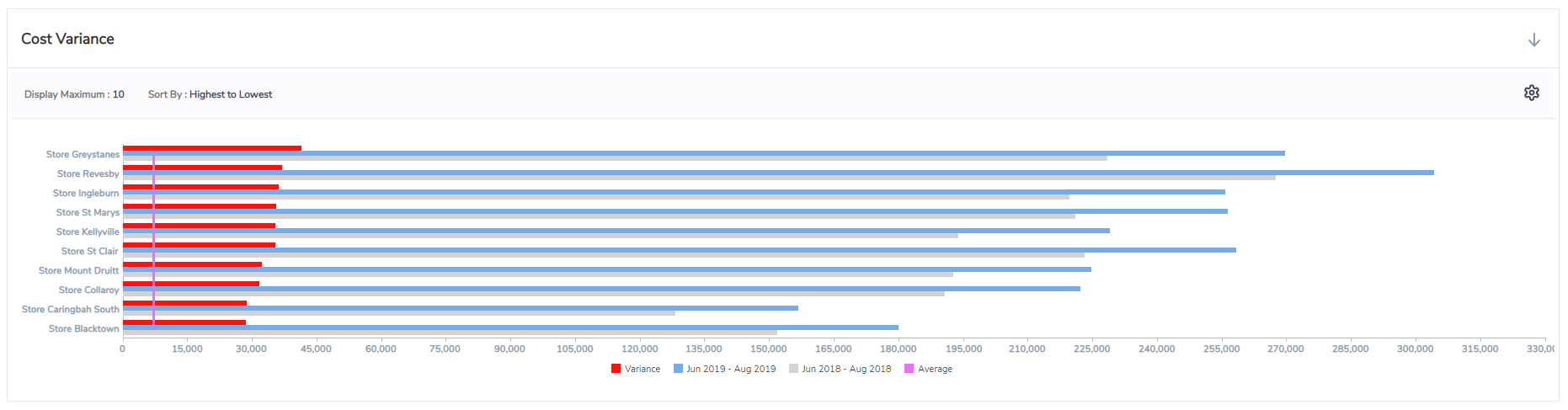
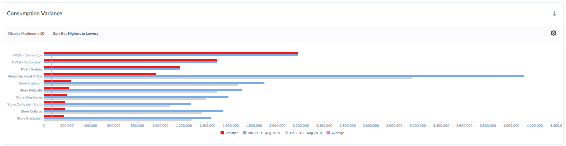
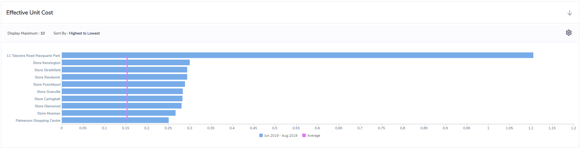
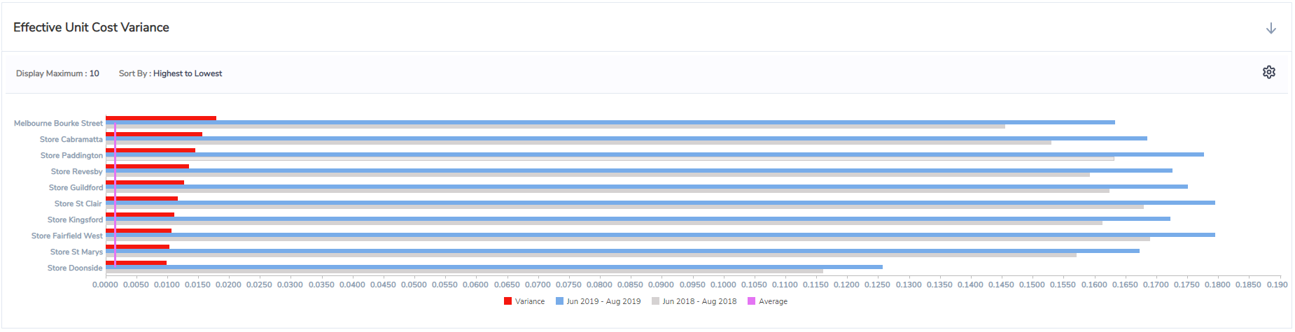
Chart Settings
In the chart setting, you can configure the chart to display up to 100 locations.
10 (default)
20
25
50
75
100
You can also sort the Locations based on their values. This can be used when you want to view the anomalies at the other end of the spectrum. e.g. to view negative cost variances first to see any Location has missing bills
Highest to Lowest (default)
Lowest to Highest

Step 4: Rank and prioritize
Ranking grid - a league table view of all locations. All cost and consumption related metrics of the selected locations are available in the league table, including variances and variances %. To rank locations based on a particular metric, click on the respective column header. Click the column header again will reverse the ranking. For example, to rank all locations based on their total cost, click on the 'Cost Mar 2015 - Feb 2016' column header and locations with highest cost will appear first in the table.
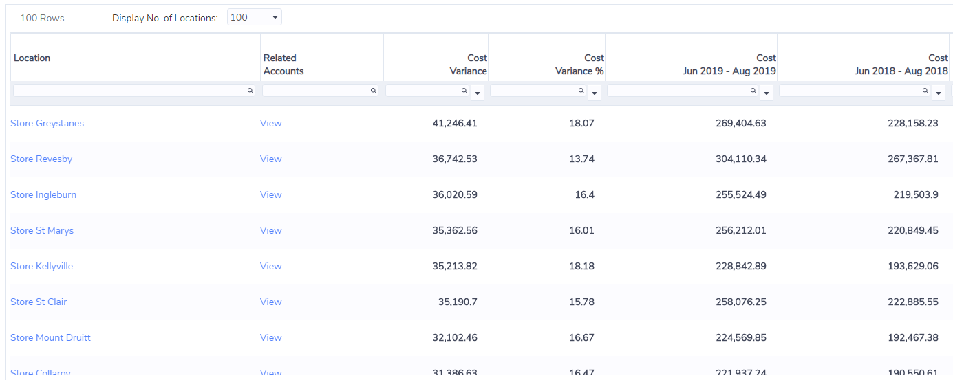
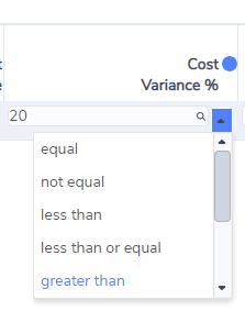
The ranking table also allows you to perform number filter and search operations. This is similar to other table views in the platform such as Locations or Accounts table. By using the number filter operation, you can further narrow down the list of locations that may have issues. For example, to see all locations with more than 20% cost variance comparing to previous period, first enter 20 into the filter box under the column header 'Cost Variance %', and then click on the filter option arrow and choose 'greater than'. Once selected, the grid will refresh and bring up only locations that have more than 20% cost variance comparing to previous period. Available number filter options include:
equal
not equal
less than
less than or equal
greater than
greater than or equal
null
not null
To further prioritize the list to identify location(s) that may give you maximum financial return of your investigation time and effort, you can further rank the locations by total cost by clicking on 'Cost Mar 2015 - Feb 2016' column header. Locations with the highest cost and also have more than 20% cost variance will now appear first in the table.
Why I can't see all my locations in the ranking table?
By default only the first 100 Locations are shown in the ranking table. If you can't find all of your locations in the ranking table, select 'ALL' in 'Display No. of Locations' option on the top left corner of the table to bring them in.
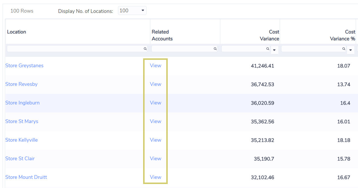
Step 5: Drill down
Once certain locations have been identified as anomalies or outliers, you can further drill down to those locations to review their details. To go to a location, click on the location name hyperlink in the Location column, this will bring up the location summary page. From location summary page, you can further check cost and consumption for each month by using location performance dashboard, or drill down further to view accounts and captured bills. If you want to view the list of Electricity accounts of the location directly, click on the View hyperlink in Related Accounts column, this will bring up a list of Electricity accounts of the location and from where you can further check cost and consumption of the account by using account performance dashboard, or drill down further to view captured bills.
Review Billing + Consumption Data
Once you have identified a location to be an anomaly or outlier which requires further in-depth investigation, you can further drill down into this location by clicking on the location name or View Related Accounts hyperlink in the dashboard ranking grid. There are a few common scenarios for conducting further investigations.
Reports for Cost Analysis
UDMA includes a set of standard reports for cost analysis.

Report | Description |
|---|---|
Account Item & Cost Audit | Extracts original invoice records with total cost and total consumption information |
Monthly Data Summary | A comprehensive report with data being normalized by calendar month, includes actual, accrual or estimated consumption and cost information for each account |