
Performance by Scope Dashboard
Summary
The Performance by Scope dashboard shows emissions and GHG reductions broken down by Scope. This dashboard also provides a monthly breakdown of emissions and lists the top 10 data types by quantity of emissions.
This dashboard can be found in the 'Monitor' main menu under 'Performance'. It will also appear under the 'Track' menu at the organization, group and location menu.
Note that all tables and charts can be exported to CSV by clicking on the table icon in the top right of each element.
Dashboard
Table - Activity by Scope
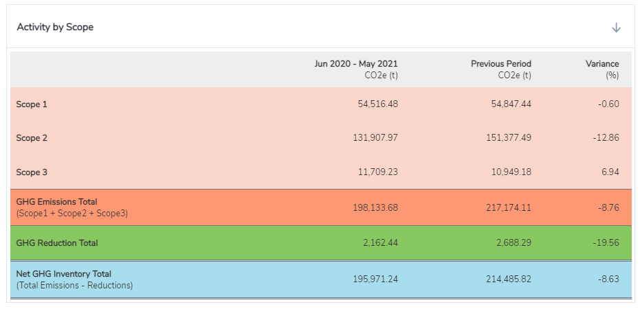
This table shows a breakdown of emissions by scope. The GHG emissions total is the sum of Scope 1, 2 and 3 emissions sources, excluding GHG reductions like carbon offsets, guarantees of origin or renewable energy certificates. The Net GHG Inventory Total is total emissions with GHG reductions removed.
This table also shows a comparison of current period vs previous. The dates are also reflective of the months selected in the time navigator.
Chart - Activity by Period by Scope
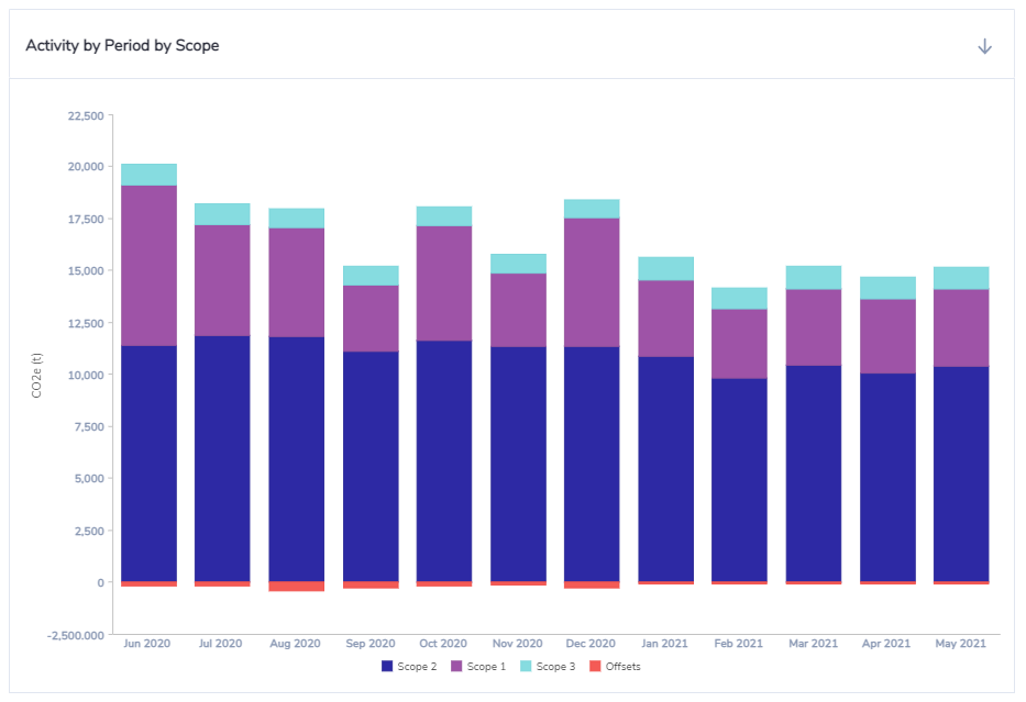
This chart shows a breakdown of emissions by scope over time. By default up to 12-month of data can be shown in the chart depending on the months selected in the time navigator.
Chart - Activity by Data Type
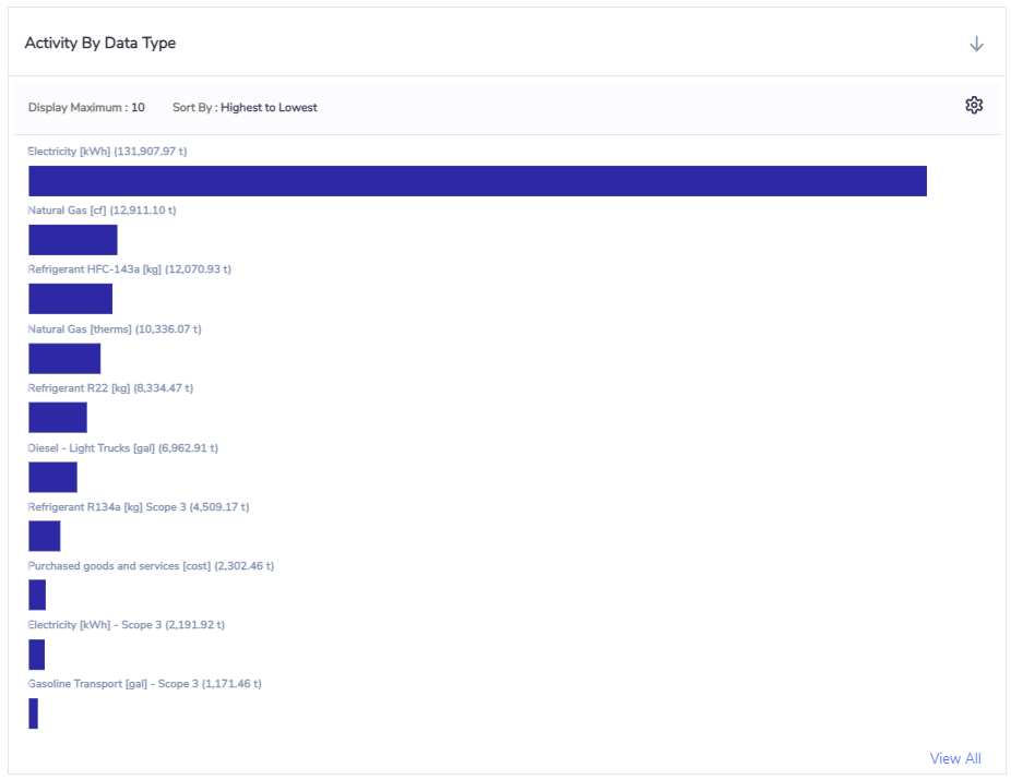
This chart shows a list of data types ranked by emissions. By default this chart shows the top 10 data types ranked from highest to lowest.
The settings icon allows these values to be adjusted - up to 100 items can be visualized and the sorting can also be reversed if required.