
Data Health Check for Utilities
The Data Health Check For Utilities dashboards help you to identify and address issues around missing utility bills or consumption for Electricity, Gas and Water data.
What are the main features of the Data Health Check for Utilities dashboards?
Ability to see missing data across a wide variety of measures and units (e.g. invoices days, usage, cost, energy and emissions)
Ability to see missing data across utilities by using common measures (e.g. cost, energy, emissions)
Ability to directly access and amend account records from Health Check dashboards
Ability to extract to Excel missing data across all suppliers, all locations or all accounts
Inclusion of all opened accounts which have not received any data within the reporting period selected
Calculation of missing data within current month
Understanding the Data Health Check For Utilities dashboards
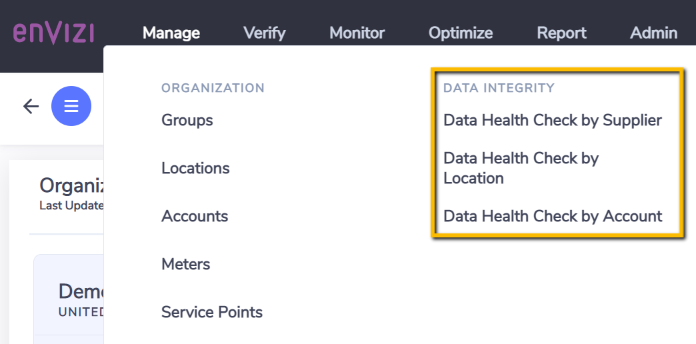
If you are capturing bills or consumption manually, Envizi provides a set of dashboards that will enable you to pinpoint where the gaps are coming from. These dashboards are called Heath Check by Locations and Health Check by Accounts. The idea here is to quickly understand how assets (Locations) or Accounts are tracking and which ones you should investigate first. From these dashboards, you will also have the ability to drill down and make amendments to the Account Records themselves and immediately see the impacts in the dashboards. What Locations have not submitted bills yet? Is a Record missing or incorrect? These two reports will help you easily answer these questions and reach resolution.
If you are using connectors to load Utility data, Envizi provides a specific dashboard that will enable you to identify suppliers for which data files have not been loaded. This dashboard is called Health Check by Suppliers. The intent here is not to perform a granular review of the Records. Instead, it is about getting an instant snapshot of how suppliers are tracking and who you should follow-up with first. Your supplier confirms that all data files were sent to Envizi? This means that either these data files contain errors or gaps, or that they could not be loaded successfully. In this case, our Support team will assist you in further investigating the problem.
Accessing the dashboards
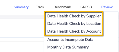
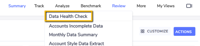
You can run the Health Check for Utilities dashboards at various level of the reporting hierarchy.
Main organization menu:
Group sub-menu:
Location sub-menu:
Structure of the dashboards
All three dashboards have the same structure:
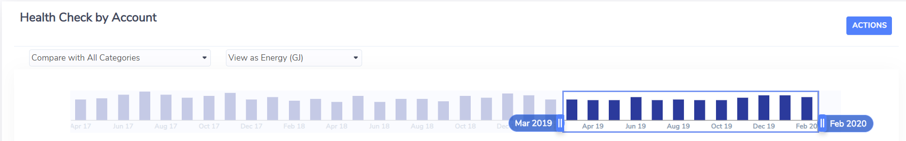
Filters and Timeline
Similar to all dashboards across Envizi, you have the ability to refine the scope of calculation by selecting a specific reporting period via For Period dropdown list or directly by interacting with the Timeline.
You can also restrict the results displayed to a specific utility via Filter By (i.e. Electricity, Gas or Water) and pick a specific measure in View As (e.g. CO2e(t)). Please note that whilst certain measures are intrinsically related to a specific utility (e.g. selecting Energy (kWh) will limit the results to Electricity) others will enable you to have an overarching view of your missing data across all three utilities (e.g. Cost (USD)).
Finally, you can further refine the results by using additional filters available from the filter icon located on the top right corner of the Timeline.
Totals
This section presents totals for Captured, Accrued and missing data for the reporting period and additional filters applied above.
"Captured" data is the sum of all actual and estimated data. "Accrued" data is the sum of system generated data which fills data gaps in designated accounts. "No Data" is the sum of all missing data evaluated by Envizi. Please note that accrued and missing data can co-exist within the results because you might have switched on Accrual calculations for specific accounts only.

Missing data by month
This section tracks captured, accrued and missing data over time on a monthly basis enabling you to quickly identify what periods to focus on. This is very useful because you can then narrow down the analysis to specific months using the Timeline.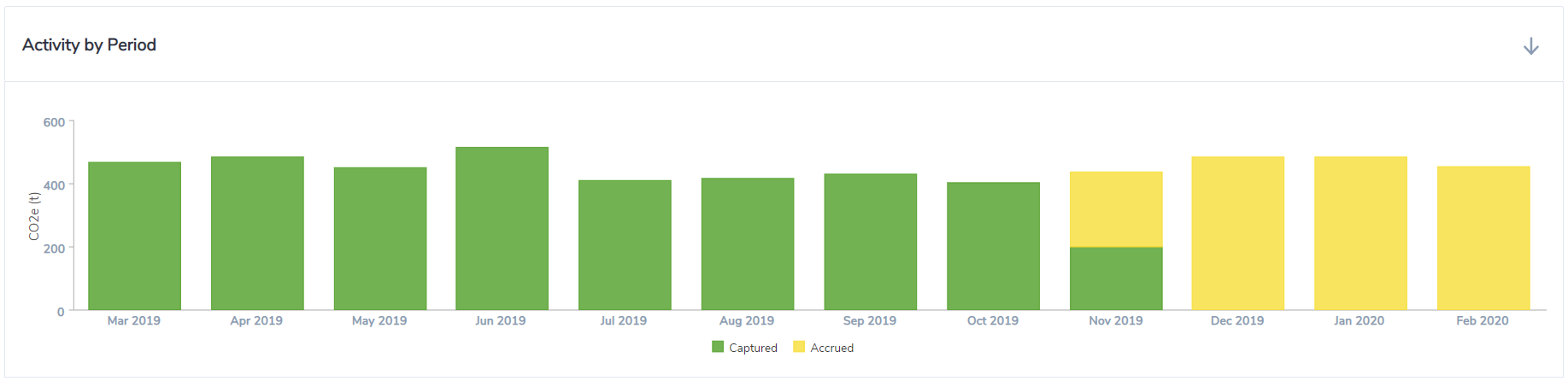
Missing data by supplier, location or account (top 20 only)
Depending on which dashboard you are using, this section tracks captured, accrued and missing data this time by supplier, location or account rather than by month. This will enable you to focus on the Suppliers, Locations or Accounts that are missing the most data first as they are listed in decreasing order of accrued or missing data.
Bear in mind that this ranking completely depends on the "View As:" measure you have selected in the Timeline. This means that this ranking may be different if you have selected invoice days or CO2e(t), for example. This is because the missing approximated emissions for one invoice day will be different between a small and a large Account.
Having the flexibility to look at the results from different perspectives will give you more insightful information and the ability to truly prioritize your investigations.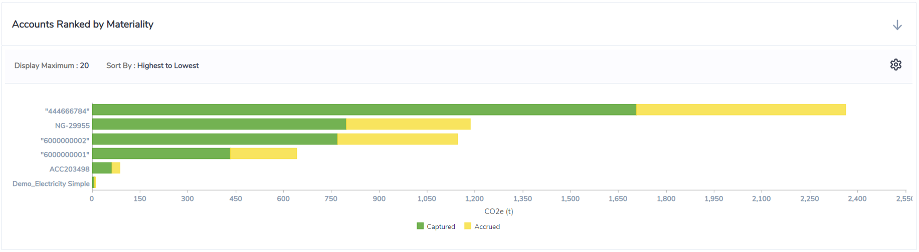
Grid
This section of the dashboard provides a grid view of the information presented in the previous section, except that you are not restricted to the top 20 Suppliers, Locations or Accounts. You can elect to display all suppliers, locations or accounts using the Display No. of Accounts dropdown list in the top left corner.
As with any grid in Envizi, you can apply filters and export to Excel for further analysis or to meet specific reporting requirements.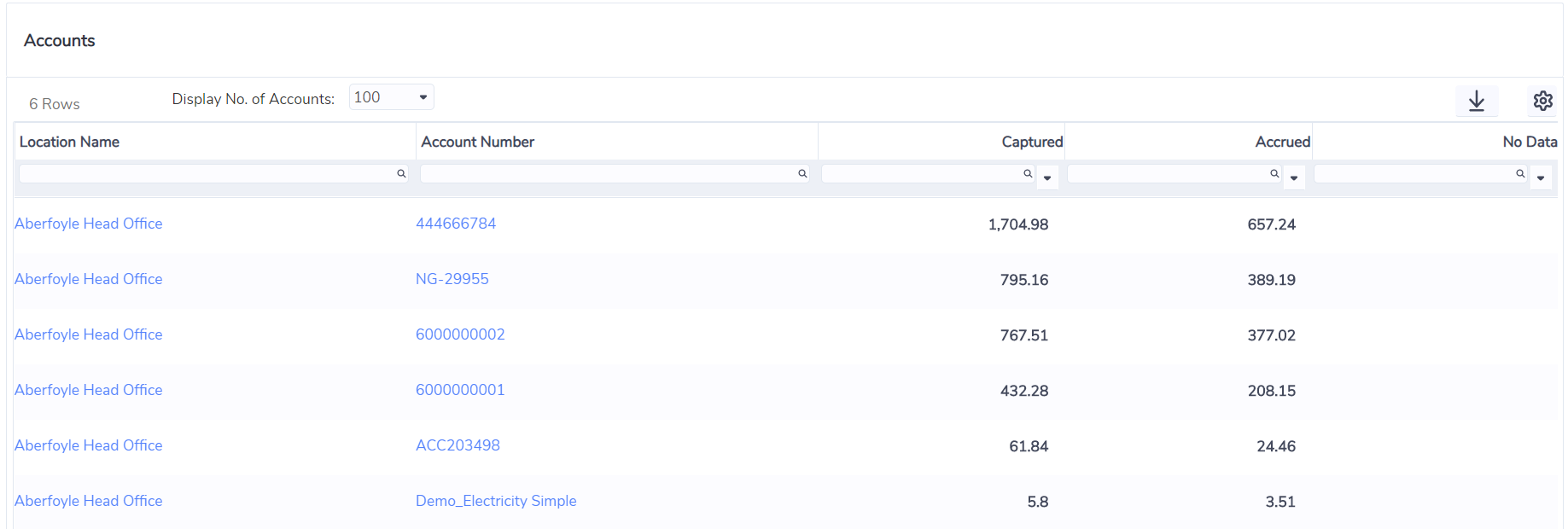
Drilling down to Locations and Accounts
Health Check by Location, Health Check by Account and the account records are connected in a logical flow that makes it easy and quick to drill down within the reporting hierarchy, see your data from different perspectives, review and apply corrections to account records and immediately see the results in the dashboards.
From Health Check by Location, use the Location hyperlinks listed in the grid to drill down to a specific Location. This will open Health Check by Account, enabling you to conduct a more detailed analysis of the accounts sitting under that Location.
From Health Check by Account, use the Account hyperlinks to jump straight to the records for a specific account. You can then review and proceed in amending the records to fix an issue if necessary. Clicking on the back button of your web browser will take you back to Health Check by Account where you can see how the changes you have just made are impacting the overall results. Note that Health Check by Account also lists Location hyperlinks next to the Accounts in the grid. Similar to Health Check by Location, this enables you to open Health Check by Account for that Location as explained above.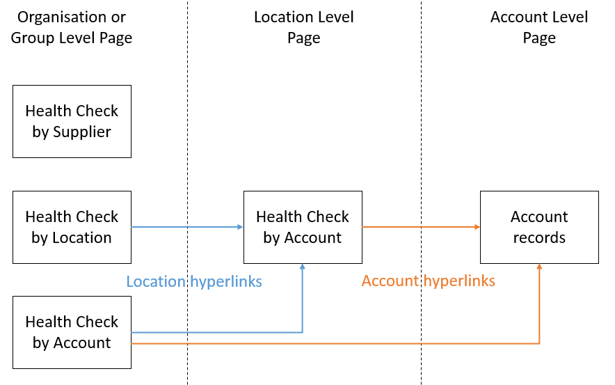
How does Envizi evaluate what is missing?
Any result displayed in the Health Check dashboards are first calculated at the account level for each month included in the reporting period selected and for all accounts included in the filter selection. The data is then rolled up to provide results in the charts and the grid as required. Note that consolidation rules (use percentage and group membership percentage) are applied according to the reporting level (organization, group or location) from which the dashboard is run.
Calculating missing invoice days
Envizi determines the number of days covered (or captured invoice days) across all bills by checking the start and end period of these records. This result obviously depends on the Opened On and Replaced On dates set up for the accounts. Note that if records overlap, we could end up in a situation where there are more captured invoice days than actual days in a month.
Missing invoice days are derived by subtracting captured invoice days from the actual number of days for each month. This result is either categorized as "Accrued" if Accruals are switched on for the account or "No Data" otherwise. Note that this categorization carries through to all other measures available in these dashboards (e.g. Cost).
Calculating missing usage and cost
When selecting usage (primary unit of measure) or cost, Envizi calculates what is missing or accrued by multiplying the missing invoice days calculated above by a daily average usage or cost.
These daily averages are both calculated by respectively averaging consumption and cost across a defined period of time (12, 18 or 24 months or whole account history depending of your configuration). Note that seasonality is not supported at this stage.
Calculating conversions like energy and emissions
When you select a measure such as CO2e(t), Envizi calculates what is missing or accrued by applying the appropriate emission factors.
In fact, whenever a measure is selected, Envizi will automatically determine whether the missing usage calculated above can be converted into that measure (which depends on your configuration). This happens regardless of the utility, meaning that if all utilities are selected, all usage will be automatically converted into the selected measure - regardless of the primary unit of measure - as long as a conversion factor exists.
There are differences between the totals displayed in the Health Check dashboards compared to the Monthly Data Summary report because - unlike the Health Check For Utilities - this report does not include:
opened accounts which have no data to report within the selected reporting period - this is normal behavior
green power accounts - Our team is investigating how we can include these accounts in the Monthly Data Summary report
There can be performance issues with the Timeline when running the dashboards for large datasets - if you experience this then we recommended that you run the dashboards on smaller data sets such as Groups or Locations.
The dashboards always use live data, not daily refreshed data.
Data categories other than Electricity, Gas and Water.