
BEPA Actual vs Expected
The Actual vs Expected Profile dashboard and the Actual vs Expected (Profile) report can be run for either a location or a meter.
The dashboard has a time navigator (which does not show any metrics) which is used to select the time period to be shown in the dashboard. The dashboard has 6 main display areas:
Display Area | Description |
|---|---|
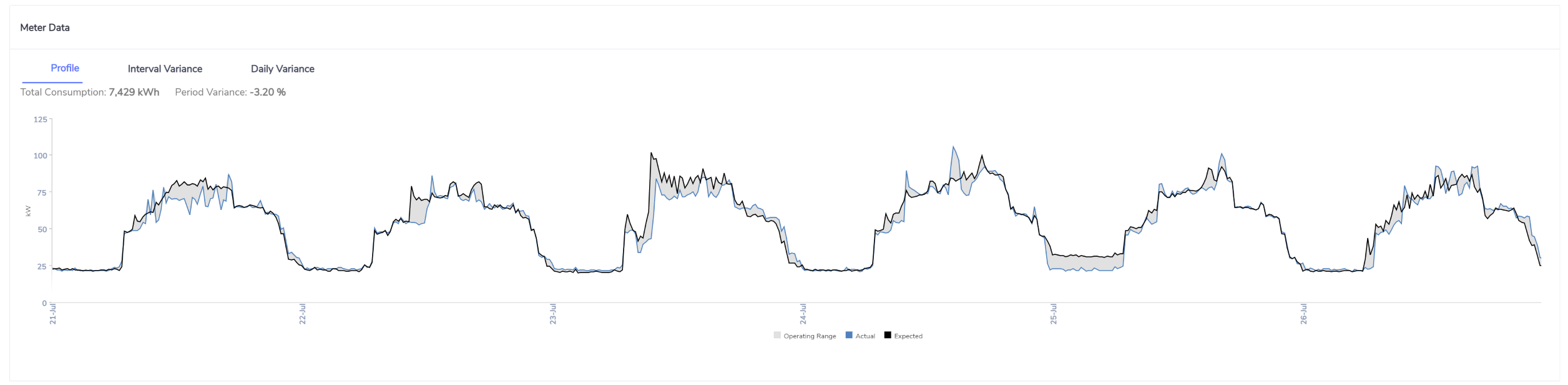
Actual vs Expected | This shows your actual electricity consumption profile vs your expected consumption profile. It also provide an operating range which reflects the maximum and minimum value for a given interval period. |
Interval Variance | This shows the variance % ( (actual - expected)/expected *100 ) for a given interval period. A positive variance is displayed as a red bar, a negative variance is displayed as a green bar. A spline line is also included with is a rolling average of the last 4 intervals. |
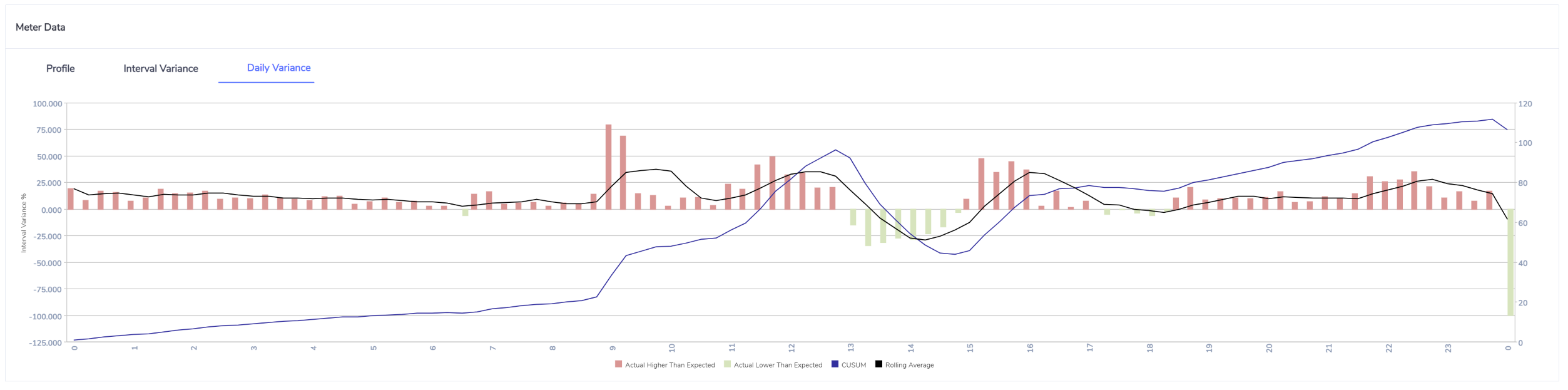
Daily Variance | This shows the variance % ( (actual - expected)/expected *100 ) for each day over the previous 3 months (from the end date being reported). A positive variance is displayed as a red bar, a negative variance is displayed as a green bar. A spline line is also included with is a rolling average of the last 4 intervals. |
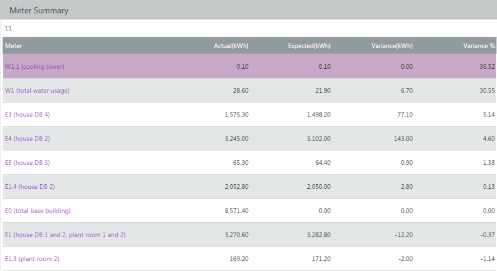
Meters | The meters table shows all meters for a given point in the metering hierarchy. If the report is run at the location level, then all meters (other than those with a meter reporting % = 0) will be included in the table. If the report is run for a particular meter, the table will include that meter and any other child meters (other than those with a meter reporting % = 0). As the meters in the table may include a mix of parent and child meters, the summed actual and expected values may not equal the reported total at the top of the report. |
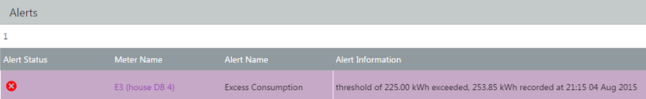
Alerts | This will provide a list of all alerts over the reporting period. |
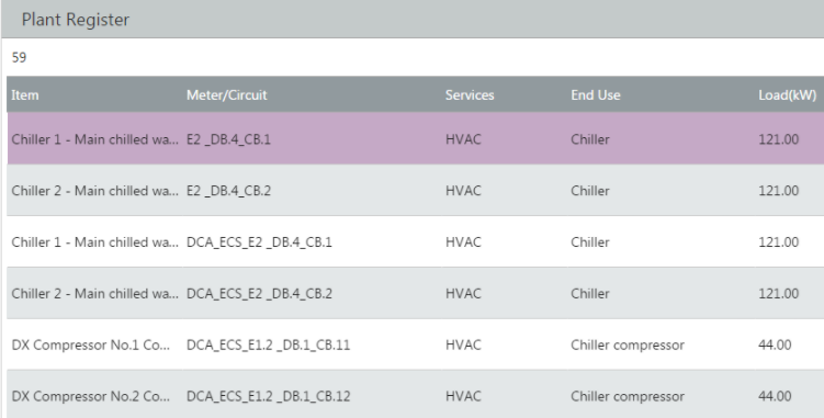
Plant Register | This will provide a list of all assets that have been captured in Envizi associated with a given reporting point within the metering hierarchy. |
Location Actual vs Expected
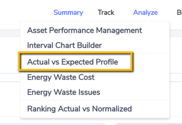
You can run the Actual vs Expected Profile dashboard at a location level. Once on the Location Summary page, navigate to the Analyze menu and select Actual vs Expected Profile.
Once you select Actual vs Expected Profile the dashboard will load and you will see your actual profile (in blue) overlaid with your expected profile (black) and operating range (grey). The expected profile and operating range (min and max values for each interval period) are based on the roll up of the individual's profiles in that location (based on your configuration options). You can use the time navigator to select a reporting period. If you select more than 7 days, the chart will default to a daily analysis, rather than an interval analysis.
Dashboard showing up to 31 days (Interval Analysis)


You can run the Actual vs Expected Profile dashboard at a meter level. Once on the Meter Summary page, navigate to the Analyze menu and select Actual vs Expected Profile.