
Interval Chart Builder
Overview
This document is organised into 3 major sections as follows:
How to guide; this provides instruction as to how the Interval Chart Builder can be used to create modify and save charts.
Frequently asked Questions; this contains a list of the most frequently asked questions and is a great go to source if you have any difficulties with the tool.
Tips and Tricks; a number of useful scenarios are provided to help create more complex presentations.
Launching charts
The Interval Chart Builder dashboard is available at meter, location and group level and replaces the existing Meter Comparison and Measure Profile dashboards.
Interval Chart Builder supports all the charting options that were available in the Meter Comparison and Measure Comparison charts and adds the following notable enhancements:
· Ability to save and share charts;
· Compare performance against same period previous month or previous year;
· Annotate charts title and description;
· Modify series visualizations such as chart style, ‘column/area/line/stacked area/scatter etc’;
· Modify series color and opacity;
· Modify axis details such as min and max values, legend, units and how the axis will be displayed;
· Arrange the series sequence to ensure that the chart is appropriately layered.
The Interval Chart Builder retains all the capabilities of selecting any measure from any meter, be that virtual or actual, and in addition, now supports the selection of location specific metrics like weather data, schedules and certain meter based attributes.
The Interval Chart Builder now can also highlight the periods that contain estimated data.
The design of Chart Builder will enable us to easily extend the measures that can be selected for display.
Interval Chart Builder can be found under the Analyze or Dashboards menu at Locations and Meters.
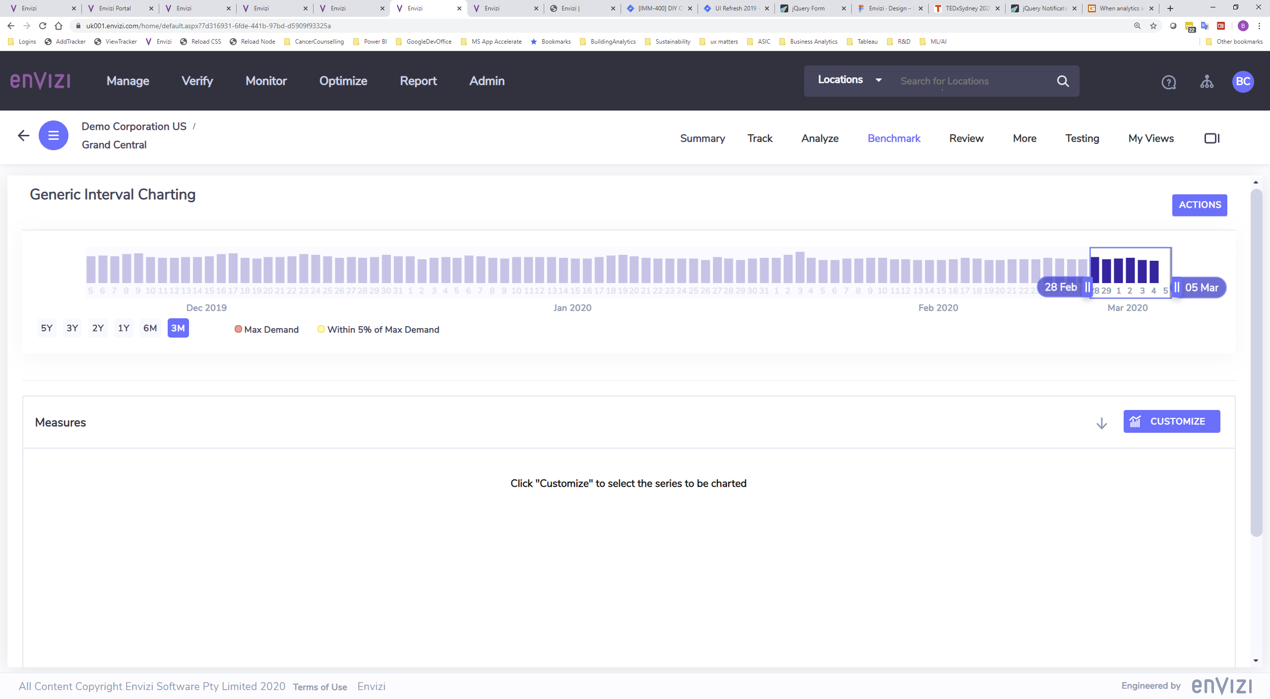
When the Interval Chart Builder dashboard opens for the first time the following message is displayed in the chart area:
Click “Customize” to select the series to be charted
Click the customize button to load the Customize Chart dialog.
Customizing Charts
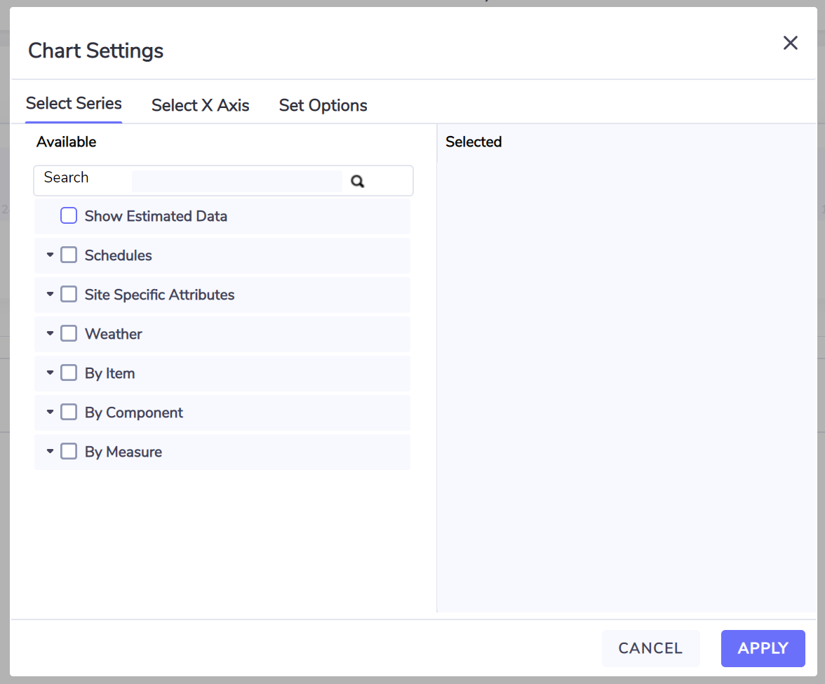
The Customize Chart dialog contains 3 main tabs:
Select Series: used to define what measures/items (series) are to be charted and the styling of each series;
Select X Axis: used to define the granularity of the time series, ie 15 minutes, 30 minutes, 1 hour or day intervals;
Set Options: used to define the optional chart title and compare with options.
Series
The Select Series tab contains a hierarchy of all the series that can be plotted.
The series are organized as hierarchies to simplify finding the desired item and measure.
The Show Estimated Data series will highlight any period that contains any estimated data for any of the series being plotted.
If location level schedules have been defined then the Location Schedules hierarchy will be displayed and when expanded will show any schedules attributes defined for that location. Plotting attributes are either on or off for a particular interval and are by default plotted as a background shaded area for the intervals that they are defined as on.
The Location Weather hierarchy provides the weather metrics from the weather station associated with the location and generally includes minimum, maximum and average temperature and humidity.
Items represent meters, sensors and equipment that have associated measures (data points).
Where there are items from multiple locations then the location name is included in the series label.
Components where present classify items into categories that describe the type of meter, sensor or equipment installed at the location(s).
Measures come in two types, measure bundled with an item (data points) and associative measures that automatically apply to all the items or locations that are currently being plotted.
Bundled measures are distinguished by the fact that both the name of the measure and the name of the item are present.
A blue check box indicates that that the series can be selected, grey check boxes indicate that this is node has underlying content.
On selecting a checkbox, the selected series gets added to the selected panel. Deselecting the checkbox removes the series from the selected panel.
A search box is provided above the series hierarchy and can be used to find the series you wish to plot. Type in the measure name or item name or part thereof and either press the [ENTER] key or click the search icon to initiate the search. The hierarchy will expand to show only those areas that match the search criteria.
Selections can be re-arranged by dragging them into the sequence required. Series are plotted with the primary axis plotted first followed by the secondary axis in the sequence that they are arranged in the selected panel.
You can remove a series by clicking the close :Close: button.
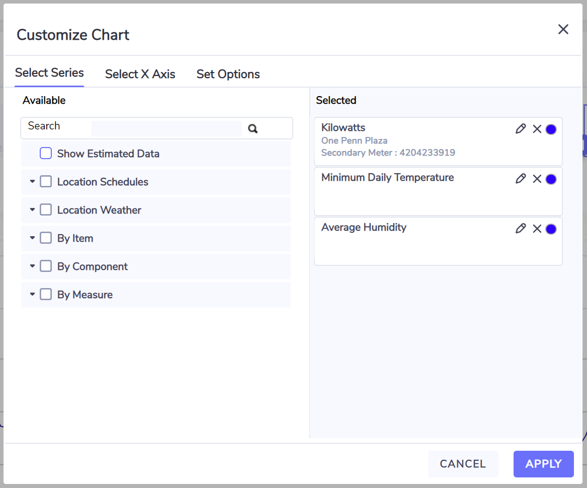
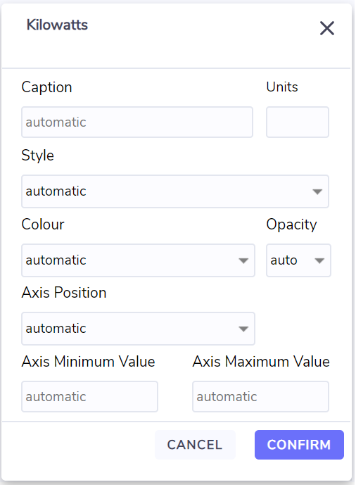
The edit button :Edit: will open a dialog where you can change the way that the series gets plotted.
A blue dot to the right of the buttons indicates that a configuration change has been applied to the series.
Series options
Caption: By default the caption/legend for the series will be of the form
Measure name, followed by Location name, followed by Item name
If items are being plotted from multiple locations then the Location name will precede the Measure name;
if multiple items are plotted then the Item name and serial number will precede the Measure name.
Entering a Caption will override the default behavior.
Units: By default the units associated with the series will be displayed, you can enter an alternate unit or enter a character like “.” or “-” to suppress the unit label.
Style: Each measure has a default style assigned to it designed to best visually represent the series. The list of styles available include:
Area,
Area - stacked,
Column,
Column - stacked,
Column - percentage stacked,
Line - simple,
Line - smooth,
Line - smooth area,
Line - smooth area stacked,
Line - smooth area percentage stacked,
Line - step,
Scatter - data plotted as points
Tip:
The Column styles are useful when viewing series with a date time interval resolution set to ‘Day’.
Scatter is useful when the series has discontinuous intervals like alerts.
Color and Opacity: you can choose a fixed color for the series and set the opacity for the color, by default Opacity is set to 1 being most opaque. An opacity of .1 is very light/see through.
Axis Position: This determines where any axis gets plotted, the options are:
On primary; with interval charts the primary axis is the left axis.
On secondary; with interval charts the secondary axis is the right axis.
On primary and do not display; plot series on the primary axis and do not display the axis.
On secondary and do not display; plot series on the secondary axis and do not display the axis.
Axis Minimum and Axis Maximum: You can override the default values to accentuate the variation or align the axis to match other series data.
X-Axis
The only series available on the x axis is Date and Time.
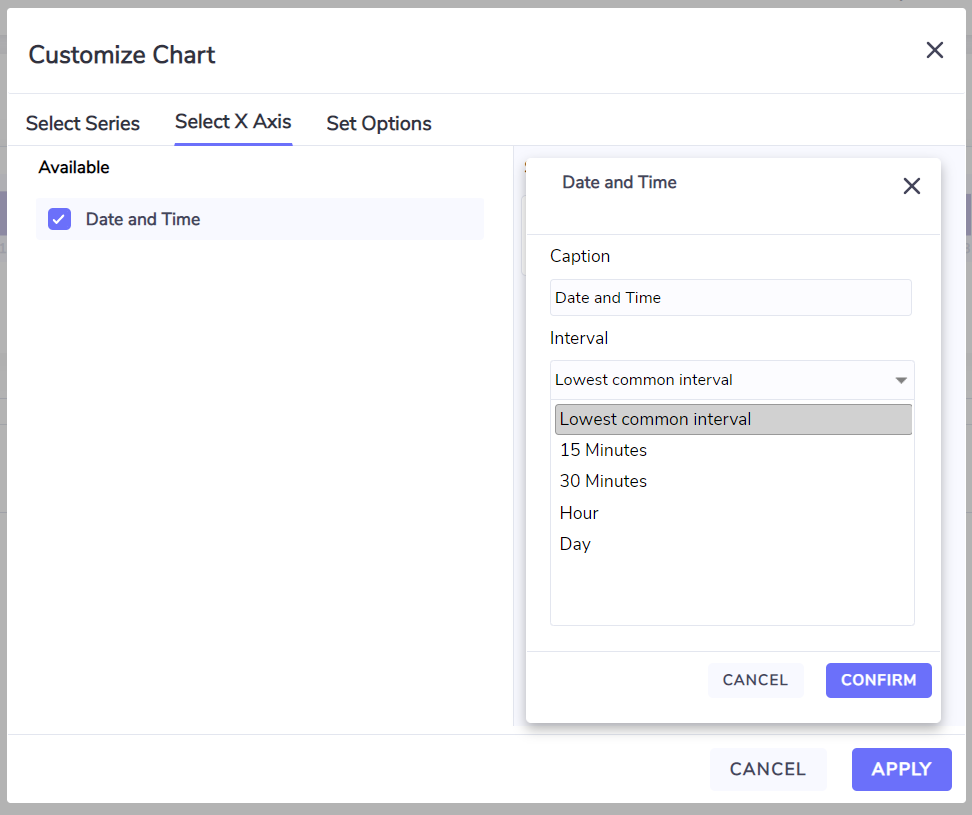
Date and time can have the following levels of granularity:
Lowest common interval; when selecting series from multiple items then the interval displayed is the lowest level of resolution of any of the items Example: if one meter has data stored in 30 minute intervals and an IoT sensor has data stored in 15 minute intervals then the x axis timeline is in 30 minute increments.
15 Minutes, 30 minutes and Hour options force the x axis to the selected option. Note that items that have a longer interval period will have gaps when plotted.
The Day option enables intra day data to be aggregated to a day.
Note that instantaneous data like kW will use the average operator to determine the value for the day and accumulative values like kWh will use the sum operator to provide the value for the day.